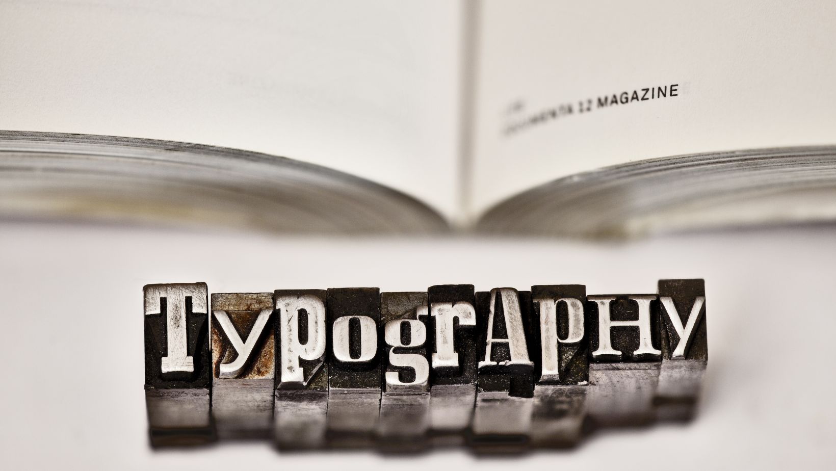
Typography plays an important role in design. If you are creating a website, a brochure, or any other form of visual communication, the way you present your text can make or break your project. It’s not just about choosing fonts that look pretty, typography also affects how easily people will understand your message and how professional your design will appear. However, it is easy to make mistakes that can ruin your work, even with the best intentions. This is why we will present you with four common typography mistakes and tell you how to avoid them in this article. Pay close attention to this article because your design will be both attractive and effective if you manage to avoid the following.
Using Too Many Fonts
The first and most common mistake people make is using too many different fonts in one design. It can look like a fun way to add some details, but it often just makes your design look messy, and people will barely read it. When there are too many fonts, it can be distracting, and your main message will get lost. If you want to avoid this mistake, stick to two or three fonts maximum. Use one font for headings, another for the body text, and maybe a third for special accents. This will keep your design clean and easy to follow. You can check out all BLKBK.ink fonts in their font collection if you’re not sure which fonts work well together. You will see which fonts are designed to match, so you don’t have to worry about choosing the wrong ones.
Poor Font Pairing
Pairing the wrong fonts together can make your design look unprofessional and hard to read. When fonts don’t work well together, it can create a jarring effect that makes your design less attractive. If you want to avoid it, choose fonts that complement each other.
For example, you can pair a bold, decorative font with a simple, clean font to create a nice balance. This will guide the reader’s eye through your content without any confusion. If you struggle to choose fonts, start with pre-made font pairs. It’s also a good idea to test your font choices at different sizes and make sure they work well in all contexts.
Inconsistent Spacing
Spacing can seem like a small and not-so-important detail, but it can make a big difference in how your design looks and feels. If the spacing between letters, lines, or paragraphs is off, your text can look chaotic and be hard to read, even if you have chosen the perfect fonts. Always pay attention to the spacing in your text.
Adjust the kerning (space between letters), leading (space between lines), and tracking (whole space between characters), and make sure that everything looks good and consistent. Consistent spacing will make your text easier to read and will give your design a more polished look. Avoid crowding your text or spreading it out too much. Try to achieve a balanced look that’s easy for the eyes.
Ignoring Hierarchy and Alignment
Hierarchy and alignment are key elements of good design, but people often forget about them. Without a clear hierarchy, your audience will not know where to look first. And if your text is not aligned properly, it can make your design look messy. How to avoid it? First and foremost, create a clear hierarchy – vary the size, weight, and style of your fonts for different parts of your text. Use larger, bolder fonts for headings and subheadings if you want to draw attention to the important information. Also, keep the body text simple and consistent so it is easy to read. Alignment is just as important as hierarchy. You can left-align, center-align, or right-align your text, but always make sure you are consistent in your design. Proper alignment will make your design look more organized and professional.
As you can see, typography is not just about choosing fonts – it’s also about making sure your design is clear and easy to understand. If you manage to avoid common mistakes like using too many fonts, poor font pairing, inconsistent spacing, and ignoring hierarchy and alignment, you can create designs that look great and spread your message to people effectively. Good typography helps guide the reader’s eye through your content, as we have already mentioned multiple times. So, next time you’re working on a design, keep these tips in mind to create something that not only looks good but also works well in getting your point across to the visitors.