Scaling a product breaks design systems. You start with a neat open-source pack like Feather or Heroicons. It works perfectly for the first fifty screens. Then requirements grow. Suddenly, you need a specific icon for “biometric security failure” or “bulk export to CSV,” and your chosen library comes up empty.
Designers usually resort to mixing and matching from different sets or drawing custom assets. The result is a fragmented UI. Stroke weights don’t match. Corner radii fluctuate. The visual language falls apart.
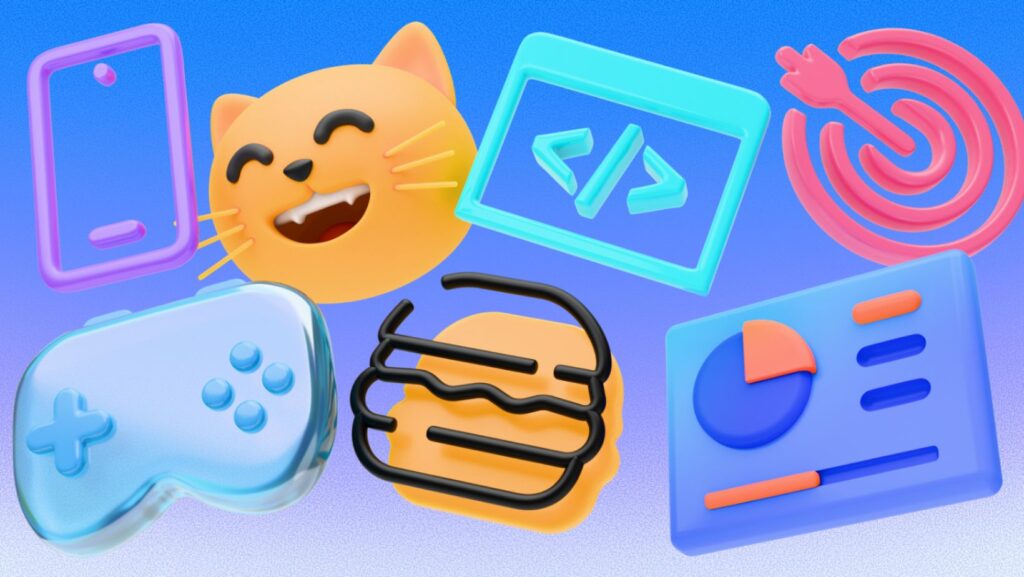
Icons8 solves this by manufacturing assets in massive, style-consistent batches rather than just aggregating them. With a library exceeding 1.4 million assets, the platform ensures that if you choose a specific aesthetic-whether it’s the utilitarian “Material Outlined” or the playful “3D Fluency”-you have access to over 10,000 icons in that exact style.
This depth answers the central question of scaling design: how do you keep a consistent visual language without the budget to build a proprietary icon system in-house?
Scenario 1: The UI Overhaul for an iOS App
Picture a design team tasked with updating a legacy fintech application to match modern iOS 17 guidelines. The project requires hundreds of navigational elements, action buttons, and status indicators.
A lead designer using Icons8 typically bypasses the browser entirely and opens the Figma plugin. The goal is strict adherence to Apple’s Human Interface Guidelines. They select the “iOS 17” category, offering three distinct variations: Outlined, Filled, and Glyph. They opt for “Outlined” to match the app’s airy, minimalist aesthetic.
As the team builds out the settings menu, they encounter niche requirements. They need icons for specific banking concepts like “recurring transfer,” “freeze card,” and “international wire.” Small libraries rarely contain these specific metaphors, forcing a break in style. Here, the designer finds over 30,000 icons strictly within the iOS ecosystem style.

Exact text searches sometimes fail. When that happens, searching by image finds visually similar shapes. Checking the “Logos” category reveals third-party payment providers. Once the assets hit the canvas, the stroke width and geometry align perfectly with the native iOS system fonts. It maintains the illusion that these assets were custom-drawn for the app.
Scenario 2: Developer Implementation and Performance
On the engineering side, the workflow shifts from selection to implementation. A front-end developer building a dashboard needs to implement the icons handed off by the design team. The priority here is load time, scalability, and code cleanliness.
Navigation bars need crisp vectors. While the free tier offers PNGs up to 100px-useful for quick mockups-production requires SVGs. Accessing the interface, the developer downloads the assets in SVG format. They make a specific choice in the settings: checking “Simplified SVG.” This removes unnecessary metadata and merges paths where possible. The result is a lighter file size that renders faster in the browser.
Static icons feel flat for “loading” and “success” states. The developer switches the filter to “Animated Icons.” Instead of embedding a heavy GIF, they download the Lottie JSON format. This enables smooth, vector-based animation that scales to any screen density without pixelation.
Dynamic content often requires a different approach. The developer might skip downloading files entirely for certain assets. By using the CDN embed links or Base64 HTML fragments provided in the download modal, they can drop the icon directly into the codebase. This reduces the friction of managing a local folder of assets and ensures images are served quickly.
A Tuesday Morning in Content Marketing
For a non-designer, such as a content manager creating a slide deck, the workflow is less about code and more about speed.
The content manager opens the Pichon Mac app, a dedicated tool that sits in the menu bar. They are building a presentation on quarterly growth and need visuals that look professional but not generic. They choose the “Liquid Glass” style to add some modern, colorful flair to the slides.
Dragging a chart graphic directly from Pichon into Keynote reveals a problem. The default green of the icon clashes with the company’s purple branding. Instead of asking a designer to fix it, they click the edit button to open the in-browser editor.
Using the “Recolor” feature, they input the company’s exact HEX code. The tool instantly remaps the colors. While there, they decide the icon needs more breathing room, so they adjust the padding and add a circular background in a soft gray. They hit download, choosing a high-resolution PNG (up to 1600px since they are on a paid plan), and drag the final asset back into their presentation.
The whole process takes less than three minutes.
In-Browser Editing and Customization
Launching heavy vector software like Illustrator for minor tweaks kills momentum. The built-in editor handles these tasks directly.
Beyond simple recoloring, the editor enables structural changes. Add text elements using standard fonts like Roboto. Overlay a “subicon.” If you have a “User” icon but need a “User Add” icon, overlay a plus sign, adjust its position, and merge them into a single asset.
Consistent spacing matters for developers. The editor lets you define a square container and adjust the icon size within it (padding). Export a set of 20 icons, and they all share the same bounding box dimensions. This prevents alignment issues in CSS or layout grids later.
Comparing the Alternatives
Understanding where Icons8 fits requires looking at the landscape of icon resources.
vs. In-House Design
Building a proprietary set is the gold standard for uniqueness. But it is prohibitively expensive and slow. Icons8 mimics the consistency of an in-house set without the six-month lead time. You trade exclusive ownership for speed and volume.
vs. Open Source (Feather, Heroicons)
Open-source packs are fantastic for their price (free) and code quality. But they are typically limited to 200-300 essential icons. They lack the depth for complex industries. If you need a “DNA helix” or “dump truck” in the exact style of Heroicons, you are out of luck.
vs. Noun Project
The Noun Project has immense variety but suffers from extreme inconsistency. Since it aggregates uploads from thousands of different authors, finding five icons that look like they belong to the same brand is difficult. Icons8 centralizes the design process. The 5,000th icon in a pack matches the style of the 1st.
Limitations and When to Look Elsewhere
Extensive libraries are not universal solutions for every project.
Budget constraints for vectors: The free tier is generous with categories like Popular, Logos, and Characters, but it restricts standard downloads to PNGs up to 100px. Responsive web design and high-res print assets require SVGs, which means upgrading to a paid plan. Students or hobbyists with zero budget often find open-source alternatives more viable.
Unique Branding: Brands relying on specific, unconventional illustration styles-like hand-drawn charcoal sketches or abstract geometric forms-will find stock icons too polished.
Attribution: The free plan requires a link back to Icons8. Commercial landing pages or client work usually demand a paid subscription to remove this requirement.
Practical Tips for Power Users
Use Collections for Bulk Actions
Don’t download icons one by one. As you browse, drag assets into a “Collection.” Once you have your set of 50 icons, apply a monochrome recolor to the entire batch simultaneously and download them as a sprite or a ZIP of SVGs.
Check the “Request” Feature
Can’t find an asset? Check the Request section. It acts as a community voting system. If a request gathers 8 likes, it enters the production pipeline. It’s not instant, but it bridges the gap for missing metaphors.
Filter by “Designers”
Icons8 is known for in-house styles, but the platform also hosts independent authors. If the core styles (Windows 11, Material, etc.) feel too standard, filter by independent designers. This surfaces unique, artistic packs that haven’t been overused across the web.
Uncheck “Simplified SVG” for Editing
Planning to modify the shape of an icon in Illustrator or Lunacy later? Ensure you uncheck “Simplified SVG” before downloading. The default simplification merges paths to save bytes. That makes editing the geometry significantly harder. Keep the raw paths if you plan to iterate on the design.