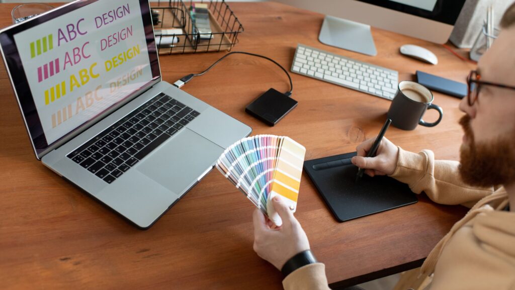
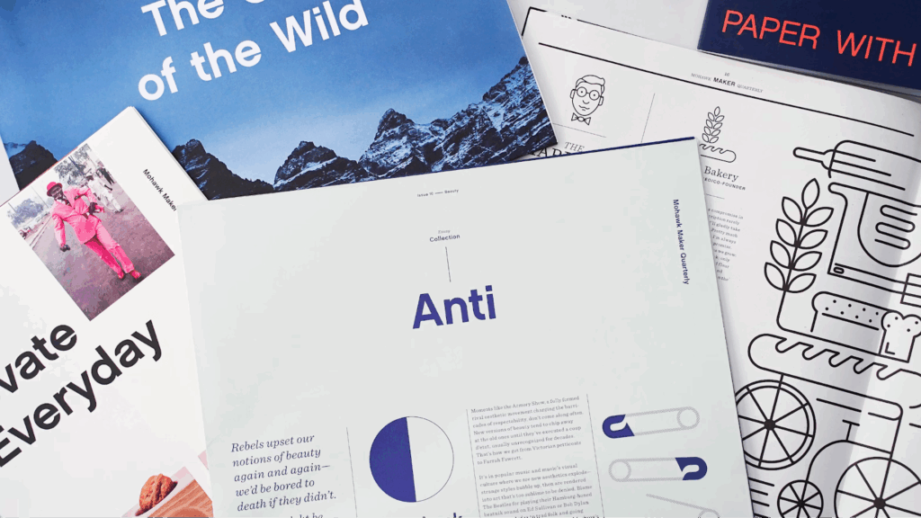
Choosing the right font for your branding is a very important step. The typeface you pick can tell a story about your business. It shows who you are and what you want people to feel when they see your brand. If you want to try different looks for your text, you can use an
aesthetic font generator from Creativefabrica. This tool helps you find the perfect style quickly and easily. Picking the right typeface helps your brand stand out and connect with your audience.
Fonts are not just letters on a page. They have personality and mood. The font you choose can make your brand feel friendly, serious, fun, or professional. That is why it is important to take time and find the best one.
“ Typography is not just about letters and spacing; it is an emotional language. Every style conveys a unique feeling, setting the tone of your digital narrative. Choosing an aesthetic typeface can instantly elevate your message, making it more memorable and engaging .” –
Marlene Widawer once said.

This means your letter form choice can change how people see your brand. Many people think fonts are a small detail. But fonts play a big role in how people remember your business. When you pick the right typeface, your brand looks more trustworthy and easy to recognize. If you make the wrong choice, your message can be confusing or boring. So, it is smart to spend time learning about fonts before you make a decision.
Match Your Font to Your Brand’s Personality
Every brand has a personality. Some brands are fun and playful. Others are serious and professional. The font you pick should match this personality. For example, a toy store might want a typeface that is round and happy. A law firm might want a letter form that looks strong and clear.
To find your brand’s personality, think about these questions: What feeling do I want to give people? Is my brand modern or classic? Friendly or formal? Your answers will help guide your font choice.
Look at fonts in different categories. Serif fonts have small lines at the ends of letters. They often feel traditional and trustworthy. Sans-serif typefaces are clean and simple. They feel modern and fresh. Script letter types look like handwriting and can feel elegant or casual.
When you choose a font that fits your brand’s personality, it creates a strong message. People will feel more connected to your brand because the typeface feels right.
Think About Where You Will Use the Font
Your typeface needs to look good in all places where you use it. This can be your website, business cards, social media, or packaging. Each place might need a different style or size of font.
Fonts that look great on a big poster might be hard to read on a phone screen. Fonts that are very fancy can be hard to read in small sizes. So, test your letter type in different places before you decide.
If your brand uses many tools or platforms, choose a typeface that works well everywhere. This helps keep your brand consistent and easy to recognize.
Make Sure Your Font Is Easy to Read
No matter how beautiful a font is, it must be easy to read. If people can’t read your message quickly, they may lose interest. Simple typefaces are often the best choice for branding because they work well for many people.
Look for fonts with clear letters and good space between them. Avoid typefaces that are too thin, too thick, or too fancy if you want to reach a wide audience. Remember, your goal is to share your message clearly. Easy-to-read fonts help you do this well.
Use Fonts to Create a Strong Visual Impact
Fonts do more than just deliver words. They create a look and feeling for your brand. Using fonts well can make your brand memorable. One way to do this is by mixing letter types carefully. Usually, brands pick one main typeface and one or two secondary fonts. The main font is used for big titles or logos. The secondary fonts are used for smaller text like paragraphs or captions.

Here are some tips to mix typefaces successfully:
-
- Choose fonts that look different but still work well together.
-
- Avoid using too many typefaces. Two or three is enough.
-
- Keep the style and mood of your fonts similar.
Mixing fonts well adds interest and keeps your designs fresh. It helps your brand look professional and creative.
Consider the Colors with Your Font
Fonts and colors go hand in hand. The color of your text can change how your font looks and feels. For example, a soft pastel color with a script font can feel calm and gentle. A bold, dark color with a strong sans-serif typeface can feel powerful and modern.
Try different color and typeface combinations to see what fits your brand best. Make sure the color you choose makes the text easy to read. Good contrast between the background and text is very important.
Test Your Font with Real People
Before you make your final decision, ask others what they think about your letter form choice. Show your font in different uses like your logo, website, or ads. See if people find it easy to read and if it matches the feeling you want to share.
Feedback helps you avoid mistakes and improve your brand’s look. Sometimes, what looks good to you might not work well for others. Listening to your audience is a smart way to pick the perfect font.
Conclusion
Choosing the right typeface for your branding takes time, but it is worth it. A good font helps your brand tell its story and connect with people. Use tools like a font generator to explore many styles easily. Remember Marlene Widawer’s wise words: typography is an emotional language. Pick your typeface with care, and your brand will speak clearly and beautifully.
 This means your letter form choice can change how people see your brand. Many people think fonts are a small detail. But fonts play a big role in how people remember your business. When you pick the right typeface, your brand looks more trustworthy and easy to recognize. If you make the wrong choice, your message can be confusing or boring. So, it is smart to spend time learning about fonts before you make a decision.
 Here are some tips to mix typefaces successfully:

